U.S. journalists have a trove of public data available to use in their stories. But even though reporters have the freedom to use the data, it’s not always easy to find. And once you do locate it, it’s often even harder to decipher.
Jeff South, associate professor and director of Undergraduate Studies, School of Mass Communications at Virginia Commonwealth University, spoke to 16 Latin American journalists, who are in the U.S. as part of ICFJ’s “Digital Path to Entrepreneurship and Innovation for Latin America” program, about the best ways to find, understand and visualize data.
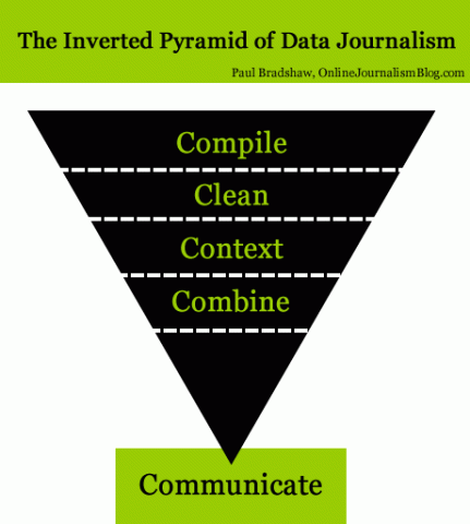
Using a graphic created by Paul Bradshaw of OnlineJournalismBlog.com, South outlined the steps needed to effectively communicate using data journalism.
1. Compile
“The first step is to find the data, of course,” South said. “Maybe that’s finding it online, maybe it’s in a PDF and you need to pull the data out of it. Wherever it is, you need to compile it.”
Beyond the usual tactics of finding information, like using social media or a search engine, South emphasized the importance of looking in the Deep Web.
“A lot of online information is not on the open web. It’s in government databases that, in the States, you have to know where those databases are,” he said. “A lot of government data is open but unless you know where to look, you won’t find it.”
South shared with the group useful databases they can use in their reporting, including the Federal Register, the U.S. Securities and Exchange Commission and the Federal Election Commission.
2. Clean
“A lot of times, data is very dirty, meaning names are not consistent,” South said. “If I was in the database, it might be ‘South, Jeff.’ Another entry might be ‘South, Jeffrey.’ Another entry might be ‘South, J.C.’ Data can be very dirty and we need to clean it up before we can use it.”
He suggested using free online tools like TextWrangler or OpenRefine to clean dirty data.
3. Context
Once you have compiled your data and cleaned it up, you need to understand it. This means asking questions like: Who gathered it? When was it compiled? What methodology was used?
Once you understand the data, then you can accurately use it for a story.
4. Combine
Journalists often use more than one set of data to get information for a story. South used the example of taking a list of all the bus drivers in a city and also taking a separate list of everyone in that city who has been convicted of drunk driving. By combining those two lists, you may find that a high percentage of bus drivers have been convicted of drunk driving, which would be a good story.
However, he also cautioned that keeping the data in context is extremely important during this step. “Correlation does not equal causation,” he said. It’s important to be aware of outside factors that could affect the data.
In addition to the four steps outlined in Bradshaw’s graphic, South included a fifth one: visualize.
“Data visualization can be really important in terms of communicating what we’re doing to the public,” he said.
South suggested using tools like Timeline JS for timelines, Infogram for infographics and Chartbuilder for charts in order create visualizations that help tell your story.
Photo credit: Paul Bradshaw, OnlineJournalismBlog.com.